
This Article From Issue
September-October 2025
Volume 113, Number 5
Page 266
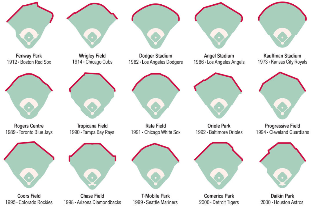
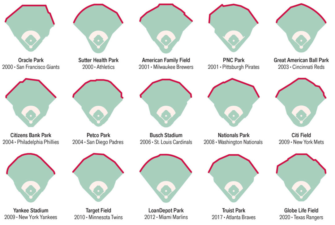
The rules of baseball are quite particular, but the regulations governing the shape of Major League Baseball (MLB) parks are surprisingly flexible. According to Section 2.01 of the MLB rule book, “The distance from home base to the nearest fence, stand or other obstruction on fair territory shall be 250 feet or more. A distance of 320 feet or more along the foul lines, and 400 feet or more to center field is preferable.” Preferable! That single word has allowed owners and architects to shape their outfields to take advantage of their environments and their teams’ strengths, making each stadium distinct. Baseball fans recognize differences between, for example, Fenway Park in Boston and Dodger Stadium in Los Angeles, and understand the advantages and disadvantages for players in each ballpark.
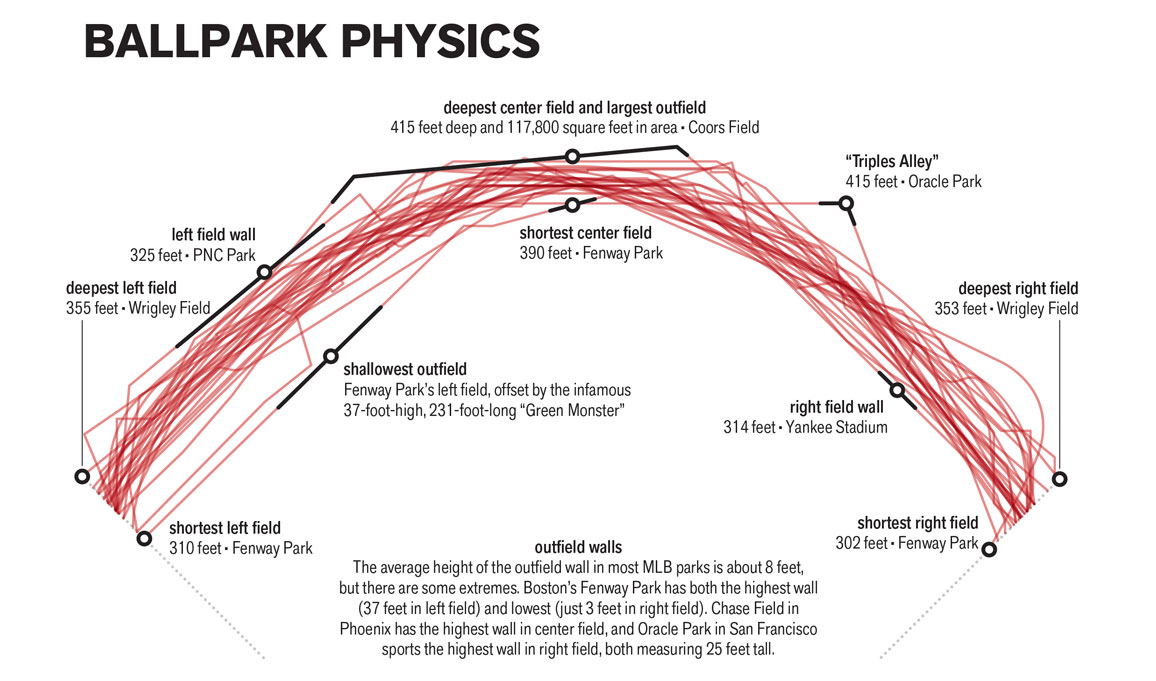
Park design directly influences gameplay. Right-handed hitters tend to pull the ball to left field; lefties like to pull to right. Power hitters prefer pitches that break toward them, which are most often thrown by pitchers who have the opposite dominant hand as the batter. In response, managers often call up specialized “closer” pitchers to challenge their opponents’ sluggers late in a game. But savvy hitters can adapt, going to the opposite field when needed. The cat-and-mouse game between pitcher and batter often depends on park geometry.
Ad Right
The oldest ballparks still in use, Fenway Park in Boston and Wrigley Field in Chicago, are the only remaining “jewel box” parks—two-tiered stadiums designed to fit within one city block. The size constraints of these downtown locations forced architects to get creative. For example, to compensate for Fenway’s shallow left field, the Red Sox erected the Green Monster, a 37-foot-high wall that blocks hits that would be home runs at any other stadium.
Coors Field, home of the Colorado Rockies in Denver, has a reputation as a hitter’s paradise. Air density at the mile-high stadium is about 82 percent of its sea level value, and the location has low humidity. That thin, dry air reduces drag and decreases pitch movement, boosting both the likelihood of a batter making contact with the ball and the distance of a hit. To counter this advantage, Coors Field features some of the deepest fences in baseball, and balls are stored in a special humidor that softens the material and reduces elasticity. The drawback of the Rockies’ massive outfield is a high rate of doubles and triples, demanding speedy outfielders.
Though park design may be tailored to favor certain types of players, today’s frequent roster turnover makes it more difficult to pair a player with a field. Still, clever front offices keep dimensions in mind when shaping teams. No doubt right-handed slugger Alex Bregman is enjoying his first season in Boston with the Green Monster just 310 feet away along the left-field foul line.
Imperial measurements are used throughout this infographic to align with the traditions and rules of American baseball.

American Scientist Comments and Discussion
To discuss our articles or comment on them, please share them and tag American Scientist on social media platforms. Here are links to our profiles on Twitter, Facebook, and LinkedIn.
If we re-share your post, we will moderate comments/discussion following our comments policy.