This Article From Issue
March-April 2007
Volume 95, Number 2
Page 176
DOI: 10.1511/2007.64.176
Creating the Twentieth Century: Technical Innovations of 1867-1914 and Their Lasting Impact. Vaclav Smil. x + 350 pp. Oxford University Press, 2005. $35.
Transforming the Twentieth Century: Technical Innovations and Their Consequences. Vaclav Smil. x + 358 pp. Oxford University Press, 2006. $45.
These two fascinating works are not a conventional synthesis of social and technological history, but instead emerge from the intersection of technical innovations, cultural geography, economic history and environmental studies. Author Vaclav Smil teaches in the Faculty of the Environment at the University of Manitoba and has written 23 books. The two under review, Creating the Twentieth Century and Transforming the Twentieth Century, make a single argument, stretching from 1867 to the present. Oxford University Press has configured them as companion volumes, with similar layouts and jacket designs. Both author and publisher declare, correctly, that each book can be enjoyed on its own, yet they deserve to be read together.
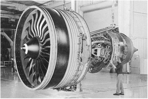
From Transforming the Twentieth Century.
Ad Right
In Creating the Twentieth Century, Smil argues that the two generations before 1914 laid the foundations for an expansive civilization based on the synergy of fossil fuels, science and technical innovation. He rejects claims that the computer and the Internet have caused unprecedented economic acceleration and argues that the remarkable growth and social change of the 20th century were based primarily on refinement and development of machines and processes created before World War I. After a first chapter on the technical level of Western societies in about 1865, Smil argues for the transformative nature of electrification (chapter 2), the internal combustion engine (chapter 3), new materials and chemical syntheses, particularly nitrogen fixation (chapter 4), and new information technologies (chapter 5). He suggests that a well-informed scientist from the end of the 18th century, such as Antoine-Laurent Lavoisier, if brought forward to witness the society of 1910, would have confronted a "world of inexplicable wonders." In contrast, "were one of the accomplished innovators of the early 20th century—Edison or Fessenden, Haber or Parsons—to be transported from its first decade to 2005, he would have deep understanding of most" of the machines and processes set before him.
Accordingly, Smil's second volume, Transforming the Twentieth Century, concerns not technical breakthroughs but the refinement and intensifying use of previous inventions and processes. Recent decades, rather than being a period of acceleration, become largely a time of consolidation. The future, rather than appearing to be a time of almost unimaginable growth, becomes more problematic, because, as Smil takes pains to document, the environmental costs of growth often have not been included when calculating progress. And calculation is the operative word, as Smil bolsters the argument with many graphs and statistics.
Taken together, the books are neither an ode to optimism nor a tale of technological determinism. Smil himself escaped from Communist Europe in 1969 to teach first at Penn State and later in Canada. He writes from a Western point of view, but he is decidedly nondoctrinaire, rejecting both simple liberalism and Marxism. His account focuses on central Europe, Britain and the United States, although Asia emerges more fully in the second volume.
Smil largely succeeds in his synthesis, in part because of his broad and balanced perspective. Just as important is his deep understanding of science and technology. For example, in Transforming the Twentieth Century, he comfortably discusses and draws into his argument chlorofluorocarbons, changes in raw material use, new techniques of oil-platform construction, atmospheric CO2 levels since 1200 a.d., fabrication machinery for silicon wafers, the chemical structure of thermoplastics, rocket engines and much more. The explication is assisted by illustrations, including maps, patent drawings, graphs and photographs. Smil marshals his wide-ranging knowledge into readable prose that any college graduate can understand.
Smil celebrates inventors, although he worries about the long-term results of adopting their creations. He writes about technology but pointedly eschews that word in favor of "technique." He writes about cultural transformation without an overarching theory beyond the conviction that technical change underlies (but does not determine) social change.
Smil has an interesting thesis and many fascinating observations, but sometimes linkages are missing. In particular, by dividing his story into two books, he makes World War I disappear from the first volume. The war seems to me its logical, if disastrous, culmination. And even in the second volume, the war receives only scattered attention. Yet the very machines and processes that Smil finds so important facilitated the mass production of death. The internal combustion engine made possible trucks, tanks and bombers. Nitrogen fixation supplied endless explosives, synthetic chemistry produced poison gas, and electrification made possible a host of military technologies, as well as the assembly line's mass production of weaponry.
Smil does not entirely overlook the military uses of these machines and processes, but he pushes warfare too far into the background. Perhaps the reason is that his books are primarily about how new technologies facilitated enormous changes in production and consumption, and only secondarily about the social, environmental, military and political consequences. Symptomatically, the atom bomb is discussed in a chapter titled "Energy Conversions." Smil cannot cover everything, even in two books. However, the trajectory of his history would feel far different if the first volume ended with a 10-page meditation on World War I, or if the second
one concluded with the conflict in Iraq.
Smil is not that sort of historian, however, but works more in the tradition of Fernand Braudel and the French annales school. They, too, focused on long-term trends, with particular emphasis on agriculture, energy, communication and transportation. Smil gives a succinct technical summary of the development of computers from 1932 to the present but devotes less space to how these machines got from the laboratory to the marketplace or their often unexpected uses. He often writes as an internalist, mostly concerned with how things were invented and how they work. Usually internalists prefer to write focused case studies, but Smil is also concerned with the changes each machine or new process makes possible. He succeeds in linking a wide range of examples in a sweeping argument that celebrates technical ingenuity, keeps in view the ecological costs of misusing this legacy and sensibly avoids both Alvin Toffler's simplistic optimistic determinism and Jacques Ellul's gloomy conclusion that the human will is powerless when confronted with "technique."
Smil never mentions the American historian and man of letters Henry Adams (1838–1918), although he does draw on Adams's younger British contemporary, H. G. Wells. This is a pity, for Adams anticipated Smil's argument that science and technical development accelerated history and transformed society so decisively during the late 19th century that it constituted a fundamental break in human experience. Adams characterized the rupture in a letter to a friend:
A world so different from that of my childhood or middle-life can't belong to the same scheme. It shifts from one motive to another, without sequence. . . . Out of a medieval, primitive, crawling infant of 1838, to find oneself a howling, steaming, exploding, Marconiing, radiumating, automobiling maniac of 1904 exceeds belief.
In his last years, Adams took thermodynamics as his starting point and concluded that because entropy was the unavoidable by-product of all transformations of energy, no historian could believe in progress. He feared the imminent heat death of the universe. A century later, Smil fears the consequences of global warming and asks, "Will this complex, high-energy, machine-dependent civilization survive the 21st century? We cannot know." Rejecting determinism, he finds our future open, but uncertain.

American Scientist Comments and Discussion
To discuss our articles or comment on them, please share them and tag American Scientist on social media platforms. Here are links to our profiles on Twitter, Facebook, and LinkedIn.
If we re-share your post, we will moderate comments/discussion following our comments policy.