Picture Perfect
By Dianne Timblin
Sandra Rendgen’s analysis of the pathbreaking statistical graphics of Charles-Joseph Minard collapses boundaries of time, allowing readers to consider him as a kind of contemporary.
Sandra Rendgen’s analysis of the pathbreaking statistical graphics of Charles-Joseph Minard collapses boundaries of time, allowing readers to consider him as a kind of contemporary.

THE MINARD SYSTEM: The Complete Statistical Graphics of Charles-Joseph Minard. Sandra Rendgen. 176 pp. Princeton Architectural Press, 2018. $60.
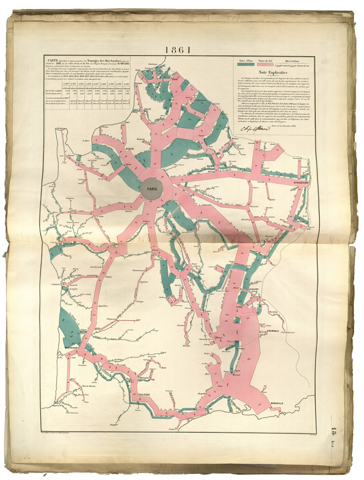
It’s disconcerting to consider that Charles-Joseph Minard, civil engineer and designer of dazzling statistical graphics, was born in 1781. The material details of his works betray their age. The papers are yellowed, with obvious wear and foxing along the edges. Yet there’s something contemporary about the data Minard depicts and how he depicts it. His interest in economic markers and infrastructure feels familiar. His technique of using color to distinguish categories of data is more at home in our time than in Minard’s own. And his restless desire to absorb information of all kinds—he investigates topics as diverse as British coal exports, the dissemination of ancient languages, Paris pavement maintenance, French wine exports, and felicitous post office locations—is practically the hallmark of our era.

Courtesy of École nationale des ponts et chaussées, from The Minard System © 2018 Princeton Architectural Press.
Today Minard is best known for a statistical graphic that details the French army’s staggering losses during Napoleon’s Russian campaign, a masterpiece popularized by the writings of statistician and political scientist Edward Tufte. The piece is a devastating beauty. Even so, as data visualization specialist Sandra Rendgen demonstrates in her forthcoming book, The Minard System (November 6), there’s a great deal more to discover about the man and his work. Dozens of Minard’s creations—all from the collection of the École nationale des ponts et chaussées in Paris—appear in its pages, meticulously reproduced and augmented by Rendgen’s thoughtful and penetrating discussion. Among the many gems included is the Russian campaign graphic’s lesser-known companion, which depicts losses to Hannibal’s army during its march over the Alps. Rendgen presents it alongside the more celebrated graphic, as originally intended.
Rendgen’s analysis collapses boundaries of time, allowing readers to consider Minard as a kind of contemporary. Insatiably curious, Minard is driven to seek information, to synthesize the data he unearths, and to share the bounty. Moreover, he is keen to transform his careful research into a form that may be shared meaningfully beyond a small circle of specialists. He understood that most readers were unlikely to pore over columns of numbers, at least not until they apprehended why the data were important.
Not only were his visualizations groundbreaking, statistics itself was a fledgling field in Minard’s time. Rendgen observes that statisticians might greet his figurative representations of data skeptically. Minard explains his approach: “The aim of my figurative maps is less to exhibit statistical results, which could be better established by numbers, than to make relationships quickly apparent to the eye . . . The figurative maps are thoroughly in the spirit of the century in which one seeks to save time in all ways possible.” In our own century, we could hardly say it better.
Dianne Timblin is the books and culture editor for American Scientist.
Click "American Scientist" to access home page
American Scientist Comments and Discussion
To discuss our articles or comment on them, please share them and tag American Scientist on social media platforms. Here are links to our profiles on Twitter, Facebook, and LinkedIn.
If we re-share your post, we will moderate comments/discussion following our comments policy.