The Near-Destruction of Giza
By Jean-Daniel Stanley
How a 19th-century French engineer saved the Egyptian pyramids from being dismantled
How a 19th-century French engineer saved the Egyptian pyramids from being dismantled

DOI: 10.1511/2005.52.110
Few visitors to the Giza plateau are aware that the pyramids, Egypt's Old Kingdom treasures and testaments to early pharaonic history, were almost dismantled about 170 years ago. It is hard to imagine that these ancient structures, the most popular tourist sights in Egypt, were nearly sacrificed as part of the plan to modernize that country. Yet, shocking as the idea now seems, Egypt's absolute ruler at the time seriously envisioned and nearly executed the project. To understand what transpired, and to place this story in historic context, one must return to early 19th-century Egypt. In 1805, an Ottoman commander of Albanian descent seized power and, with his Ottoman mandate, became the viceroy of Egypt with the rank of pasha. Muhammad 'Ali Pasha controlled the country until his death in 1849, and the dynasty he founded held power for more than a century.
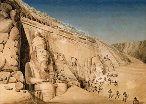
Stapleton Collection/Corbis
Muhammad 'Ali's reign was particularly energetic and presaged the development of Egypt into a modern state. The many "wishes" he expressed during his 44 years at the helm were clearly understood as commands, and many pertained to large-scale public projects throughout the country.
To execute his civil improvements, Muhammad 'Ali depended on Egyptian as well as foreign specialists, particularly French and English engineers. He eventually sought the counsel of French-born Louis Maurice Adolphe Linant de Bellefonds, who at the age of 18 first visited Egypt in 1817. Linant had no formal training, but he was placed in charge of public works in Upper Egypt in 1831. Only a few years later, in 1837, he became chief engineer of all such projects in the country. The key to his success was reliable and speedy execution of diverse assignments. During the course of many years of service in Egypt, Linant gained the trust of Muhammad 'Ali and eventually became a member of the viceroy's privileged advisory council. He was appointed Minister of Public Works in 1869, retired shortly after, received the grand title of pasha in 1873 and died in Cairo in 1883. The engineer described the projects and personalities of his professional tenure in a hefty memoir published during 1872-1873. In this summary volume, he described how the viceroy commissioned many kinds of construction projects, including Nile waterways, irrigation canals, port and coastal structures, bridges and roads, railroads, wells and changes to Cairo's city plan. Not the least of Linant's great accomplishments during nearly 40 years of service was his role in building the Suez Canal.
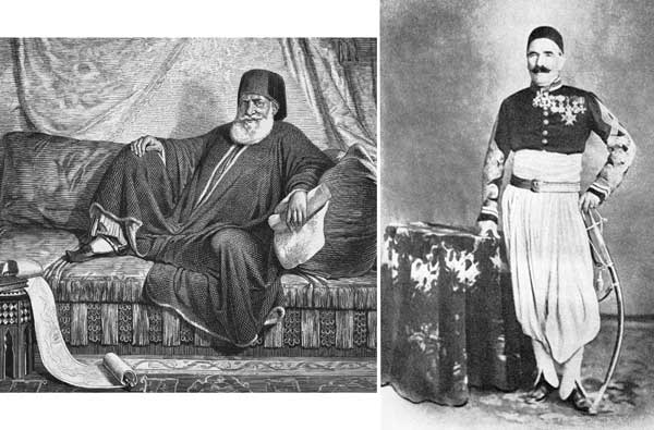
(Linant photograph reprinted from Morsy, Magali, ed., 1990, Les Saint-Simoniens et l’Orient, Vers la modernité, courtesy of the publisher, Édisud.)
If ever there was a time and place for one engineer to help modernize a nation, it was mid-19th-century Egypt. Linant's position of key responsibility enabled him to compile a particularly valuable account of the major engineering tasks with which he was involved, including the construction of barrages (dams) that regulated the flow of the Nile River for irrigation. Had the friendship between Linant and Muhammad 'Ali not been so close and long-lived, historians might be skeptical of the engineer's account of the viceroy's wish to have the pyramids dismantled. Although Linant does not provide the exact date of the pyramid saga in his Mémoires, he notes that Muhammad 'Ali had already decided to build barrages on the Lower Nile. This time probably corresponds to late 1833, when laborers began working at a barrage site in the delta north of Cairo. The viceroy expressed his desire to speed barrage construction by dismantling the pyramids to provide a large supply of pre-cut blocks. Linant tells us that the autocrat and his advisors considered the three largest structures for demolition, and they discussed various schemes for stone-by-stone removal or destruction by explosives. To highlight the seriousness of the plan and the narrowness of its defeat, Linant described Muhammed 'Ali and his normal way of proceeding with a plan. The headstrong ruler used a "full speed ahead" approach that demanded the complete dedication of his councilors and engineers. Linant wrote: "En Égypte on veut que les choses une fois decidées se fassent comme par enchantement;...et tout doit être sacrifié à cela." In other words, once in motion, all means should be undertaken and no obstacle should interfere with, or delay, a project.
Although he was personally opposed to the demolition plan, Linant knew that if he declined or failed to move expeditiously on this task, the viceroy would select another engineer in his place. Facing what he termed Muhammad 'Ali's "deplorable proposition," Linant recounts that he did not object or directly counter the viceroy. Rather, he wisely used less conspicuous means. First, he requested permission to study the Giza site to assess the demolition task and provide a logistical plan. He also organized a preliminary visit with the Egyptian ministers of foreign affairs, public works and education. Linant compiled a careful report, which compared the cost of using material scavenged from pyramids versus newly cut stone from quarries, surmising that the quarry material would be cheaper. He judged that the majority of available blocks in the largest of the three pyramids, Khufu or Cheops, was of good quality. However, the report pointed out that Khufu contained four times more rock than was needed for the barrage works. Thus, demolition would require the selective removal of many blocks—at considerable cost. Blocks in the other two pyramids (Menkaure and Khafre) were of mixed quality, especially in the smallest, Menkaure, which did not contain enough suitable rock to meet the total needs for barrage construction. Linant also noted that even if the project used blocks from Menkaure, the cost of additional stone from quarries would excessively raise the overall price. Finally, Linant estimated that, regardless of the specific pyramid source, the project would incur further expenses to recut those blocks too large for barrage construction.
The skillfully crafted report provided specific time constraints and cost estimates for the viceroy's consideration. For example, it detailed the best method for disassembling a pyramid, including a series of cranes positioned to displace and lower the blocks. The facile transfer of material from pyramid base to the Nile plain below would require a 1,000-meter-long ramp of sand faced with rock. Of course, engineers would have to modify the canals so that these waterways could transport blocks from below the Giza plateau to the barrage sites. Thus, Linant itemized the costs of terrain preparation, taking into account the movement of large volumes of soil. The proposed work schedule incorporated the need for terracing at pyramid sites and the time allotted for rock removal. Among other details in Linant's proposal was a projected work rate for an early phase of upper pyramid removal: 480 blocks moved per day. The report recognized that the rate of block removal would increase as disassembly advanced, consequently lowering the cost per volume of rock. The total cost was 15,401,280 Egyptian piasters, a sizable amount at the time.
Linant anticipated that the estimated costs in his report might dissuade Muhammad 'Ali from his straightforward plan to obtain pre-cut stone. With so many projects already under way and a growing shortage of funds, would the viceroy really want to pay for the first-phase removal of 28,800 pyramid blocks—an amount six times greater than that needed for an equivalent volume of rock from quarries? Linant calculated the total volume of rock required to construct the barrages at 1,288,551 cubic meters. The average cost of one cubic meter of rock transported from Giza: 10.20 piasters. The cost of commercially quarried stone was only 8.35 piasters per cubic meter. Financially overextended, Mohammad 'Ali was convinced by the bottom line. The ruler told Linant that the quarry solution would be the better one in any case, because it would enable him to shift more workers to still other projects, rather than waste time on pyramids.
Word of this matter spread, and some officials expressed gentle dismay about the engineer's poor form in countering the viceroy. The French General Consul in Egypt, having caught wind of plans to demolish the pyramids, published in newspapers a diplomatic letter that opposed "vandalism" but refrained from mentioning the ruler. Most people would agree with Linant that at least this potentially terrible state of affairs ended well. If Egypt places any more monuments on the Giza plateau in the future, they might think to add one to Linant de Bellefonds for his work and honorable defense of history.
Click "American Scientist" to access home page
American Scientist Comments and Discussion
To discuss our articles or comment on them, please share them and tag American Scientist on social media platforms. Here are links to our profiles on Twitter, Facebook, and LinkedIn.
If we re-share your post, we will moderate comments/discussion following our comments policy.