Bart Bok's Black Blobs
By Michael Szpir
Molecular clouds and the birth of stars
Molecular clouds and the birth of stars

DOI: 10.1511/2001.22.0
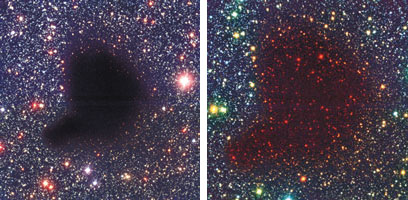
There are places in our Galaxy so dark they appear to be nothing at all. When these shadowy corners of the Milky Way were first observed through a telescope, astronomers believed they were looking at holes in the fabric of space itself. Indeed, images of such "holes" (below) can be pretty eerie—one almost expects Rod Serling to step forward.
Be not afraid. We now know that such dark places are actually black clouds—made of molecular hydrogen (H2), a little helium and some interstellar dust—which are so opaque that they block the passage of any starlight that might be behind them. Despite their apparent nothingness, these molecular clouds turn out to be exceedingly important: They are the places where stars are born.

Images courtesy of the European Southern Observatory.
The molecular cloud shown here, called Barnard 68, is a relatively small variety known as a Bok globule. For astronomers, the beauty of Bok globules lies in their simplicity. Tiny kin to the much larger giant molecular clouds, which can be hundreds of light-years across and contain the mass of a million Suns, Bok globules such as Barnard 68 are only about half a light-year across and weigh in at about two solar masses. Whereas the process of star formation in a giant molecular cloud is hidden in the confusion of complex turbulence and strong magnetic fields, the action inside a Bok globule is believed to be much simpler.
The challenge for astronomers is to pull some information out of the darkness. About 99 percent of the Bok globule consists of hydrogen and helium, both of which are fairly sedate in the chilly (16 degrees above absolute zero) environs of Barnard 68, and so offer few clues about the cloud. Most of the remaining one percent is the very component that makes Bok globules opaque—the interstellar dust.
Ironically, the obscuring dust is also the means to understanding the cloud's structure. Interstellar dust absorbs and reddens light in a way that astronomers understand very well. By assessing the degree to which light is attenuated in different parts of the cloud, astronomers can deduce variations in the cloud's density.
This is precisely what João Alves of the European Southern Observatory and his colleagues have done (Nature, January 11). Using the Very Large Telescope and the New Technology Telescope, both in the Chilean Andes, Alves and his colleagues were able to measure the degree to which the dust extinguished light coming from stars behind the cloud. An infrared image of Barnard 68 (above, right) reveals the presence of stars behind the Bok globule. Infrared wavelengths, which are a little longer than visible light, merely wiggle through the dust in the cloud.
What the Alves team found is that the density of matter in Barnard 68 increases steadily toward the center of the cloud. It conforms to one of the simplest models of stellar structure, a polytropic sphere, in which thermal pressure alone supports the globule against gravitational contraction—something that the Dutch-American astronomer Bart Bok first predicted back in 1948. In this instance, the astronomers think that Barnard 68 is only marginally stable, and may be on the verge of collapsing. Given its size, this particular Bok globule would collapse to form one or two low-mass stars similar to our Sun. In a few million years the darkness of Barnard 68 may fall in on itself and a dazzling light will shine in its place.—Michael Szpir
Click "American Scientist" to access home page
American Scientist Comments and Discussion
To discuss our articles or comment on them, please share them and tag American Scientist on social media platforms. Here are links to our profiles on Twitter, Facebook, and LinkedIn.
If we re-share your post, we will moderate comments/discussion following our comments policy.