Falling Through the Screen
By Anna Lena Phillips
Vintage literature for children reveals the authors’ prescient hopes and fears about digital technology.
Vintage literature for children reveals the authors’ prescient hopes and fears about digital technology.
DOI: 10.1511/2013.105.466
As a kid in the 1980s, I spent hours playing the computer game Oregon Trail on a friend’s computer, which displayed only bright green characters on a black field. By 2000, when I graduated from college, screens were no longer monochrome, and e-mail had become part of daily life. Having grown up during the peak transition from analog to digital media, I’m fascinated by U.S. culture’s dual enthusiasm and skepticism toward digital culture. Since the 1950s, when the first commercial computers were introduced, people have expressed these contradictory responses in conversation, books and essays, and, of late, online comments.
Children’s literature offers a singular view into how attitudes toward digital technology have developed: how we imagine its emergence, who we think should have access to it, and what it means for our autonomy. Faced with the necessity of writing clearly and simply, children’s authors have revealed their concerns more transparently than other writers. In the process, they have grappled with important cultural implications of digital technology, sometimes years before these issues became common in mainstream adult conversation.
Three intriguing computer-themed works for children convey their authors’ excitement and concern about the new technology. Danny Dunn and the Homework Machine, a 1958 chapter book, explores the uses of computers and the inclusion of women in science; Katie and the Computer, a 1978 picture book in which a girl goes on an adventure inside her family’s new personal computer (PC), introduces young readers to how PCs work; and “Computers,” a 1983 poem, reminds computer users of their own power and agency. Each work tries to interest children in computing technology, but each also warns of its limits.
During my Oregon Trail days, at age nine, I encountered the most recent of these works, which asserts people’s ascendancy over computers. My father took me to see Gwendolyn Brooks read, and he bought me her slim green volume, Very Young Poets, published in 1983. In this book, Brooks includes a poem titled “Computer.” It begins by defining computers, calling them “interesting” and “useful.” But having applauded this rapidly spreading technology, Brooks ends with a declaration of sovereignty: “I conduct a computer. / A computer does not conduct me.”
I don’t remember feeling the weight of Brooks’s statement when I first read it. “Computers” was just a poem about how cool computers are. At the time, PCs were a novelty. The need to assert agency in the face of them was far from my experience and likely far from that of other young readers. But in the space of 12 lines, the poet distills emerging concerns about the balance of computer and human intelligence—and, consistent with Brooks’s style, in a way that empowers children rather than condescends to them.
An earlier exploration of the relationship between computers and users appears in Danny Dunn and the Homework Machine (1958) by Jay Williams and Raymond Abrashkin. Part of a series about the scientific adventures of Danny and his friends Joe and Irene, it tells how the three discover that an early mainframe computer can do their homework for them. The brisk narrative is bracketed by discussions of what computers can and can’t do. Early on, Irene talks with the professor who made the computer:
“It’s—it’s fantastic, like science fiction,” she said. “A machine that can work all sorts of problems, give you answers to anything you want to know! It’s a kind of Superman!”
“No, my dear,” he said. “It is only a kind of supertool. Everything in this machine is inside the human head, in the much smaller space of the human brain.”
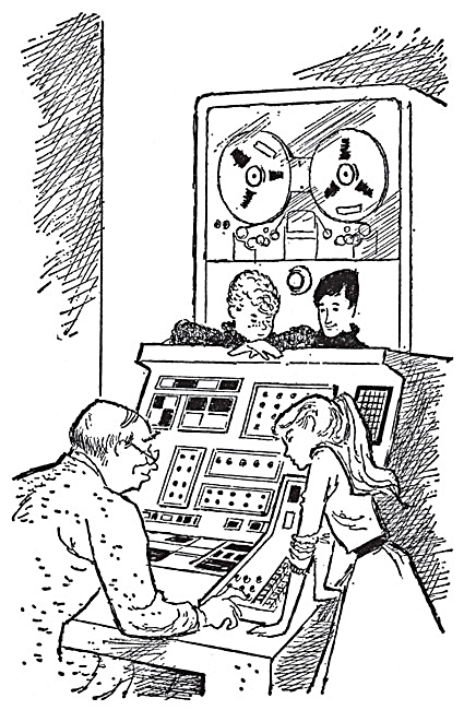
The three friends use this supertool—named Miniac, in a nod to MANIAC mainframes of the 1950s—to expedite their homework. They input questions, and the machine outputs the answers on an electric typewriter. The computer’s otherwise invisible work likely fascinated contemporary readers. It recalls a time when computing hardware was both more remarkable and more accessible, when computers contained components—thermostats, electric switches—that might be found in a garage workshop.
The children’s teacher, Miss Arnold, and Danny’s mother catch on to the homework scheme. Miss Arnold, rather than forbidding use of the computer, assigns harder homework. Only at the end of the school year do the three friends realize that, in programming the computer to provide correct answers for their assignments, they have had to master all of the material anyway. In ostensibly delegating their homework to the computer, they exceeded their own perceived limitations. The book thus conveys a sense of excitement about the technology—one couched in a parallel excitement about human capability.
"I conduct a computer. A computer does not conduct me." —Gwendolyn Brooks
Danny Dunn and the Homework Machine is the fourth book in a series, and it is the first in which Irene appears. The authors, accordingly, help Joe and Danny—and readers of the book—accustom themselves to the idea of girls and women who are skilled in science. Meeting Irene for the first time, Danny remarks,
“It’s interesting that you know about science.”
“Why not? Didn’t you ever hear of women scientists, like Madame Curie, the discoverer of radium?”
“Oh, well—sure!”
“I’m going to study physics when I get to college,” Irene continued, calmly.
The effort can feel a bit heavy-handed, and plenty of gender stereotypes remain unchallenged—for instance, that mothers are especially good at multitasking makes an appearance. For its time, though, the deliberate inclusion of a girl in such a story is noteworthy.
Danny and his companions are illustrated by Ezra Jack Keats, the renowned children’s book illustrator best remembered for the 1962 picture book The Snowy Day. Keats’s clean lines and expressive faces are effortless, pleasing, and much in keeping with contemporary inclinations toward mid-20th-century design. The book’s original cover is similarly attractive; even the title typography, a tall sans-serif font in bright red, green, and blue, seems to be saying, “This book is destined to be celebrated by kids on the homework machines of the future!” Indeed, the book has a devoted following among tech bloggers, and a home in its original format: It’s still in print.
Perhaps Danny Dunn holds our interest because enough time has passed for the descriptions of the homework machine to seem quaint. Or perhaps it’s because the book reflects, in sweetly optimistic terms, ideas about computers and humanity that resonate with our current hopes and fears. Whatever the case, the book seems likely to endure well past its 50th anniversary.
By the 1970s, mainframe computers were commonplace, and the latest in computing technology was the PC. That era yielded Katie and the Computer, by computer writer Fred D’Ignazio, with illustrations by Stan Gilliam. This book, aimed at readers younger than those of Danny Dunn, is at heart an effort to interest children in how computers work and how we use them. To this end, the authors employ a time-tested device: They catapult their heroine into a fantastic alternate universe. In imagining that it lies within a computer, they prefigure cyberspace, which William Gibson introduced in his early-1980s science fiction.
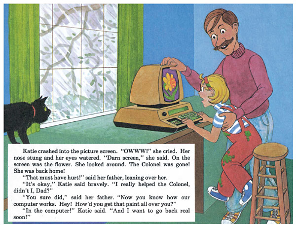
The book begins in the real world as Katie, a young girl, goes with her father to bring home a new computer. Initially, she’s not impressed: “Looks dumb,” she says. “Just a TV with a typewriter stuck on the front.” But the new device literally draws her in:
As Katie typed “flower,” she leaned closer and closer to the picture screen. Then she lost her balance and fell forward. But instead of bumping her nose on the glass, she went right through it and began spinning and falling, just as if she’d fallen off the top of a tall mountain.
Landing in a staticky snowdrift, Katie meets the Colonel (a geeky pun on kernel), a character decked out in brass buttons and stripes, who is essentially a software program made manifest. The Colonel conducts Katie through the sequence of steps that will cause a flower to appear on her computer screen back home. At the end of the book, the flower is created in a firework-like display, and Katie falls back into her regular life to see the flower on the screen. This is a world, the authors suggest, that she can visit again and again.
Although Katie and the Computer deals less with questions of human agency than does Danny Dunn or Brooks’s “Computer,” hints of this concern still appear, focused in this instance on the time computers supposedly save us. Among the characters Katie encounters is the Table Manager, “a frail, fragile man with fists full of paper scraps,” who dives into a mountain of papers to find the address to which bytes of information should travel next. We might expect the author to choose an infinitely efficient robot to direct this traffic; such work is precisely the kind of task that’s amenable to automation. Instead, at the center of the computer is a human being still stressed out by much the same work that PCs promised to free us from.
D’Ignazio probably made this choice to keep things interesting and relatable, and perhaps to avoid using one computing concept to craft a metaphor for another. Nonetheless, the Table Manager’s emotional state foreshadows the idea that the technologies around us, rather than reducing workloads, enable us to spend ever more time working.
The authors, like Williams and Abrashkin, are also well aware of the gender imbalance in computing science. Their hero is a girl, and D’Ignazio and Gilliam each dedicate the book to someone with their last name and a feminine first name, presumably a wife or daughter.
As a technology primer, Katie and the Computer has its flaws. It was likely hard for readers of the book in the 1970s to match up all the particulars of the wild world Katie encounters with the way computers actually worked at the time. But the authors’ point is that she’s at home in the computer world and having fun—and everything inside that world has to happen really fast for things to go right. These ideas come across just fine. In this regard, the authors had an easier task than they would if they were writing today: Now that the screen itself shows just about anything we could want it to, interesting kids in computers’ inner workings may be more challenging.
Despite its worthwhile aims, the book has not had the sustained appreciation accorded to Danny Dunn. Although it is still available in some library collections, the book is out of print, and references to it online are largely academic; the rainbowed, cartoonish illustrations and late-1970s design look dated. Unfortunately, the need for books like this one remains. Women are still under-represented in computing science—not to mention people of color, who have only glancing roles in Katie and the Computer and do not appear at all in Danny Dunn.
The hopes of Brooks, Williams and Abrashkin, and D’Ignazio and Gilliam are clear: that young people will feel both the power and the possibility of computing technology, and that those who do will find ways to engage with it that preserve their selfhood. To be empowered to use a device well, one needs a sense of self discrete from it, as both Brooks’s final lines and Danny Dunn’s experience with the homework machine suggest. In this regard, Danny‘s and Katie’s stories have an advantage that current computer users do not: They’re discrete narratives. The characters engage with computers and then they stop, at least temporarily, for the happy ending.
To frame her experience in the computer, Katie comes back out of the screen to talk with her father (and, we can hope, to pay attention to the neglected, comically drawn cat who appears at the margins in several of the illustrations). If only our sleek laptops and tablets ejected us so forcefully back into the world when we completed a task within them. A grown-up Katie today might spend time as both a user and a creator of such technology. She would probably have a much harder time separating herself from her devices than her younger self did. She might do well to post those lines from Brooks on her desktop—as I am tempted to do.
Authors will likely continue to try to translate for young readers the experience of working with computers, in an effort to make a nearly omnipresent—and often taken for granted—part of life in the Western world remarkable again. In the meantime, Danny, Katie, and the speaker of Brooks’s poem allow present-day readers the chance, via the ancient technology of the book, to step back a bit and appreciate the novelty of computing technology—and, perhaps, to mourn its earlier days, when the scope of its effects and possibilities was the province of writerly imagination.
Click "American Scientist" to access home page
American Scientist Comments and Discussion
To discuss our articles or comment on them, please share them and tag American Scientist on social media platforms. Here are links to our profiles on Twitter, Facebook, and LinkedIn.
If we re-share your post, we will moderate comments/discussion following our comments policy.