
This Article From Issue
September-October 2024
Volume 112, Number 5
Page 263
Miguel José Yacamán is known for his skills with developing electron microscopy techniques for understanding the structure of particles at the nanometer scale. He’s a professor of applied physics and materials science at Northern Arizona University, where one focus of his research is the correlation of structure and properties in nanomaterials. He is applying this work to the development of new catalysts to produce cleaner fuels, but his collaborations span from working on Alzheimer’s disease mitigation, antibacterial materials, and COVID-19 detection, to teaming up with artists and sculptors to translate science concepts into art. José Yacamán is amazed by the types of symmetry he sees in tiny crystals at the nanometer scale, and he explores how the existence of these shapes can tie back into expansive physics concepts and theories, from entropy and chaos to string theory and the idea of the existence of multiverses. José Yacamán was a plenary speaker at the 2023 International Forum on Research Excellence (IFoRE), and spoke with editor-in-chief Fenella Saunders after the conference about his work. (This interview has been edited for length and clarity.)

Courtesy of Miguel José Yacamán
What got you interested in this field?
I was doing my PhD in solid state physics. At that time, we’re talking about the 1970s, a big goal of the scientific community was to grow large silicon crystals that could be used to produce wafers for microchips. It was not clear how to grow these huge crystals. My PhD thesis consisted of a study on the initial stage of crystal growth, which starts with small crystallites. But when I was working with the electron microscope, I saw that when the crystallites start to grow, they have a pentagonal shape. That shape is totally inconsistent with what I was told in my classes on crystallography. In chapter one of crystallography textbooks, they tell you that five-fold symmetry is forbidden. Five-fold symmetry means that if I divide 360 between the crystal’s sides, that number is symmetrical, and only 2, 3, 4, and 6 are allowed. Five is not allowed because it gives you an irrational result.
Ad Left
Why was it thought that five-fold symmetry couldn’t exist?
If I have a two-fold symmetry, if I rotate the crystal 180 degrees, all the atoms fall in the same place. When I rotate it by 70.2 degrees, the atoms will not match. There is a disagreement, so that is not real symmetry, because symmetry means that you reproduce the same thing. It doesn’t have what’s called rotational symmetry. That problem got me hooked for many years and I published some papers on it. But the consensus at the time was that it was not real five-fold symmetry, but a kind of pseudo five-fold symmetry caused by what’s called twinning, in which two crystal molecules basically stick together. But later on in the 1980s, research demonstrated the existence of crystals that had perfect five-fold symmetry. That got me even more interested. It meant all the explanations we gave were not valid. I can say that only recently have we begun to understand it.
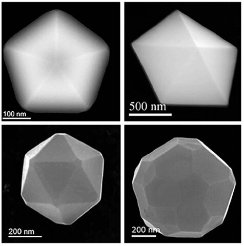
G. Casillas, et al., 2012. Journal of Physical Chemistry C 116:8844.
What I found is that the crystallite particles have, many times, what is called chiral symmetry: When I divide the sides, I get what’s called the golden ratio, which was discovered by Leonardo da Vinci. We’re very used to the number pi, but the golden ratio is also irrational, and it appears much more often than pi. It’s used in architecture and art. It appears in nature in many ways: in flower petals, or if you cut an apple horizontally, you can see this five-fold symmetry. One explanation could be that this shape maximizes the light that the plant receives. Then you have viruses. The most lethal viruses, such as the ones for COVID or HIV, are icosahedron shapes, which are five-fold. Now, the explanation for why they have that shape is possibly that’s how they can reach maximal infection. But for the physics of crystallites, there was no possible explanation for five-fold symmetry. And that’s what we needed.
What does the golden ratio indicate about the structure?
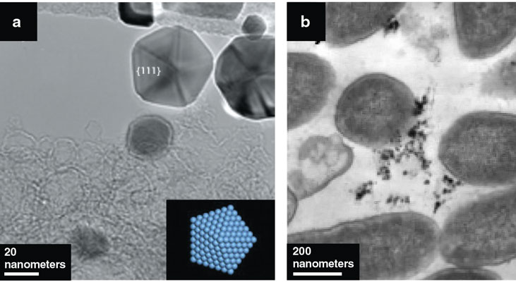
In a pentagon, if you trace lines and join the vertices like a star, you produce another decahedron in the center, and you can repeat that to make more decahedrons. Physicists or mathematicians call this self-similarity. It means that this shape is a fractal. And whenever you have a fractal, you have chaos. In systems that are more complex, like the weather, there are many components and chaos can make it unpredictable. But when you have just a few variables, chaos can be regular. There are what’s called quasicrystals that are between chaotic and complex, and grow in a way that is very similar to what happens with the weather, or with many other things that are the result of chaos. A quasicrystal is made of several different elements, it has order but it’s not periodic, and the distance between atoms is a factor of the golden ratio. And when the crystals are forming under a condition of chaos, sometimes it gives you five-fold symmetry.
Let’s say I take a quasicrystal, but I assume there are four dimensions, one more in addition to the directions x, y, and z. Then the plot of this very complicated structure is just a simple cube. Physicists are now thinking that higher dimensions exist. Different fields of physics are arriving at the same conclusion, that probably our reality is that we are projections in three dimensions of these higher dimensions. So the shape of this simple crystallite connects with string theory and physics theories that predict multiverses.
J. R. Morones et al., 2005, Nanotechnology 16:2346.
How do chaos and entropy relate to the five-fold symmetry?
In the formation of a crystal, there are many forces that interact. One is the interaction between the atoms. Another is the interaction of grain boundaries, the surface where two crystallites get together, and maybe the crystallite is strained. A crystal grows because of this quantity, which is called the Gibbs energy, or free energy: When it’s at a minimum, you get a crystal structure, but when it’s not at the minimum, there is no structure.
People assume that entropy is equal to disorder. That’s not true. Entropy might lead to order. The correct way to define entropy is it’s like diversity. Of course, the second law of thermodynamics says that entropy should always increase. However, the forces in a system are competing with one another, so the Gibbs energy is not necessarily the source of entropy.
Why would you want to increase disorder in a material?
I also work in catalysis. For clean energy, catalysis is very important. The problem is, you need an electrode of platinum to produce that catalysis. In your car, the catalytic converter is made of platinum, rhodium, and palladium. Of course it’s a very small amount of platinum, but there’s just not enough platinum in the world to meet all our needs for catalysis. So one of our goals is to try to find substitutes for platinum. By introducing several elements, you introduce disorder. The disorder gives you more catalytic effect. That’s one application of this concept, how to play with the maximization of the lack of periodicity in the crystals.
Why does disorder increase the catalysis reactions?
When you grow a crystal or a quasicrystal, you reach stability. When you reach stability, you can have a very smooth surface, or a rough surface. If I grow a normal crystal, I’ll get a very flat surface. If I grow a quasicrystal made of multiple metals, I get a surface that’s very rough at the atomic scale. So the number of catalytic sites increases dramatically. More surfaces create sites where there are kinks in the structure that need one more free electron, so they interact with matter and produce more catalysis. That’s what we are doing now, we’re combining other metals such as iron, copper, and cobalt to find new catalysts that can take the role of platinum.
Are there other energy-related applications for your work?
Another topic I’m working on is thermolytic materials, which take heat and convert it into electricity. Imagine that all the heat in your car is converted to electricity so you can charge your battery. Solar cells only capture visible light, and the visible spectrum is only 40 percent of the light, so the rest is infrared. I work in trying to develop materials that capture that infrared. The problem is that these materials are very inefficient. A good solar cell has around 20 percent efficiency, whereas thermolytic materials now are around 5 percent. I’m exploring different thermolytic materials by mixing metals to find one that will be more efficient.
The other topic I’m working on is nuclear reactors. Nuclear energy has to be a part of the future for clean energy. However, the reactors we have now are massive, and they’re not 100 percent safe. But there is a new generation of light reactors that are smaller and are very safe because they exhaust all of their uranium. The problem is that these reactors have to work at 1,000 degrees Celsius, and with very high doses of neutrons. At present, we don’t have any materials that can withstand that temperature and level of radiation. The most promising materials for this application are what are called intermetals, materials made of several metals. I’m testing quasicrystals and other combinations to see whether we can improve their resistance to temperature and radiation. Because there are so many possible combinations, we’re generating a very large database of metal properties and then will use machine learning and artificial intelligence to predict working combinations.
How has your expertise in electron microscopy advanced your research?
I always tell my students that using the electron microscope is like playing the piano: You have to practice and practice, and then you that find you have mastered it. Early in my career I discovered that I could determine the shape of nanoparticles. And catalytic materials are nanoparticles. People want to know their shapes because the different facets produce different reactions. When I first published that work, I didn’t know anything about catalysis, but that imaging had a tremendous impact in the catalytic community.
Later, I was approached by a friend who’s an archaeologist, who was puzzled by some ancient murals. The Maya and their descendant people used a blue pigment, and when archaeologists discovered their ruins, after 500 years of being in the jungle, all the colors were faded except the blue, and the archaeologists wanted to understand why. I did electron microscopy to determine the structure of the blue pigment, and I found out that there are nanoparticles in that material. Electron diffraction tells us about crystalline structure of the material, and that lets us see the atom positions and the chemical composition. [See “The Enduring Forest Gardens of the Ancient Maya,” for more on Maya culture and lifestyle.]

Tim Zaman/Wikimedia Commons/CC-BY- 3.0
Does the ability to see crystalline structure have applications in biology?
Our group was the first to explain why nanoparticles of silver have antibacterial properties. We also demonstrated that nanoparticles can kill viruses and fungus. What happens is that the silver nanoparticles, when they come in contact with humidity, release silver ions. Some of these ions will go through the bacterium’s cell membrane and damage its DNA. But not only that, some of the released ions will be redeposited back into the particle and give it a charge. So the nanoparticles are attracted to the membrane, where they build up and destroy it. The nanoparticles will both destroy the membrane and damage the DNA inside the cell.
Now, the work we’re doing is using a technique called surface-enhanced Raman spectroscopy, which uses nanoparticles to enhance the electromagnetic scattering from surfaces, to detect cancer. Tumors produce some biomarkers that are stored in sialic acid. If you check the level of sialic acid in saliva or blood, it gives you an indicator for the disease. Every tumor uses a different sialic acid compound. So far we have been able to distinguish pancreatic, kidney, and breast cancers. We believe that if things go well, in a few years your doctor could do a rapid saliva test on the spot for cancer, so it can be caught in time to be cured. In a preliminary study, our number of false negatives was only 3 percent.
What made you decide to focus your research on imaging?
My father was a medical doctor. He used microscopes to do analysis, and I was fascinated by my father’s optical microscope. But then what really changed my life was when I was in the second year of my physics bachelor’s degree, there was a huge conference of the American Physical Society in Mexico. I was hired as a projectionist. At the time you had these carousels with slides, and Richard Feynman, a very famous physicist, came up to me with the slides for his presentation. And I told him, there’s a group of students that would like to talk to you, let’s meet at the break outside. Then we started to talk to him. It was an incredible gathering. We said, what do you want to talk about, physics? And he said, no, I’m going to talk about music, because I just came back from Brazil, where I spent my sabbatical and I learned to play the bongos. (By the way, if you see the movie Oppenheimer, they have Feynman playing the bongos. That’s not true; he learned to play them in the 1960s in Brazil.) But we asked him, what do you recommend that we work on? He talked about some topics with us, and he said, read my paper, which is called “Plenty of Room at the Bottom.” I read it later, and in it he talked about the need for an improved electron microscope and the possibility of seeing atoms. That’s when I decided I was going to go into electron microscopy, and I’ve been in that field all of my career. The images are absolutely fundamental to research. Now we can see atoms, and we can make chemical analyses atom by atom. That’s made big changes in the possibilities for designing materials. I used my first microscope in 1968, and it was a very old machine with low resolution. So I have witnessed going from that to the atomic resolution that we have now. It’s been a great journey.

American Scientist Comments and Discussion
To discuss our articles or comment on them, please share them and tag American Scientist on social media platforms. Here are links to our profiles on Twitter, Facebook, and LinkedIn.
If we re-share your post, we will moderate comments/discussion following our comments policy.